British Broadcasting Corporation, widely known as the BBC, began in 1922. With daily broadcasts in Marconi’s London studio, BBC grew to become of the world’s most recognized news outlets. The BBC is an independent organization funded by license fees. Operating as an autonomous corporation under Royal Charter, the BBC does not have a president but an Executive Board which is chaired by Director-General Mark Thompson.
When visiting the BBC homepage is a dull experience. You’re faced with a white background and a bunch of sections that look cluttere d with stories. Some of the section heads are different sizes but it the sizes do not get smaller as you scroll, instead they start large, get smaller then get large again. The section headers also seem to follow a pattern for the coloring of the titles. The larger titles have different colors while the smaller titles are all red. The menu at the top of the page gives you the separate section with a quick click but is stationary as you scroll down. If you’re ready to spend a Tweet or share a post to Facebook from the site you’ll have to click a specific story because nowhere on the homepage does the social media appear.
One of the fun features of the website is the sections on the right hand side of the page which has sections with clever names. If interested in cars you can click on “Autophiles” and if you want the latest in the art world you can click on “State of the Art.” Because the BBC has such a far reach, at the bottom of the page is a gray box with 27 different languages available at the click of a button. If you don’t have time to scroll and want to know what’s trending, the right hand side features a box with the most Shared, Read and Watch/Listened stories on the website.
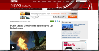
When I clicked on the article I wanted to critique, I was brought  to BBC News which looked a bit more lively than the BBC homepage. The top of the page had the different sections in line at the top and they were all a dark red to stand out against the red of the header.
The article on the Ukrainian crisis begins with a video, which sets the tone for the article, about the most recent developments in the conflict between the Ukrainian government and rebel forces. One of the first things I noticed was the sharing options at the top of the story for either Facebook or Twitter which are also found at the bottom of the story as well.
There is only one external link in the text which leads you to a press release from the Ukrainian president’s official website otherwise all links are outside the article and leads you to other stories related to the Ukrainian crisis. The map of areas discussed in the article features color coded zones for the Ukrainian troop buffer zone, Ukrainian troop withdrawal line and date, Separatist buffer zone and the Separatist withdrawal line along with the date.
There is an analysis that could have been put into some of the dead space on the right side because it throws you off as you’re reading the article. Thin gray lines at the top and bottom of the text separate it from the article and I feel it would have been better if it were a gray box instead. I had to take a moment to question whether it was part of the article or separate.
One of the most useful parts of the article was toward the bottom of the page called “More on This Story.” This section offered video links, related stories, stories focusing on the background of the conflict as well as links to other news sites regarding the same story. A very helpful part of the external sites is a star which indicates if a registration or subscription may be needed for that site in order to read the story.
I feel the BBC homepage is boring until one of the sections is chosen. There is no links to the BBC’s social media sites and the stories seen cluttered and slightly unorganized. The site is friendly to non-English speaking individuals and those looking for a specific set of news i.e. sports, entertainment or world news.
